Case · Sample audits
Sample audit reports: what the structure and conclusions look like
Both samples come from demo stores I built myself. They are not client stores and contain no client data. They exist so you can see the report format, the evidence chain and the level of detail in the recommendations before paying.
Sample, not client data
Every number in the samples is constructed for demonstration. No “lifted X%” claims appear here, because a single page change cannot prove causal uplift.
Sample A: home storage store (demo)
Sample, not client data
1. Screenshot
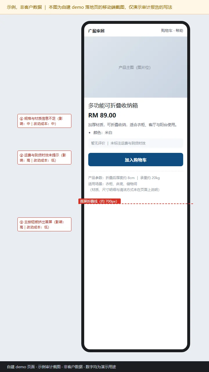
2. Evidence
- PageSpeed Insights (mobile, demo domain): LCP around 2.8s, hero image not served at mobile dimensions.
- Microsoft Clarity (demo sessions, constructed data): roughly 60% of mobile sessions leave within 15 seconds of the hero; clicks cluster around the price, the primary button area receives few taps.
- GA4 (demo property, constructed data): checkout-entry events are low relative to add-to-cart events, meaning the drop-off happens before checkout rather than inside it.
The data above comes from a demo store I built and only demonstrates how the evidence chain is written; it is not an industry benchmark.
3. Priority
| Issue | Impact | Effort | Priority |
|---|---|---|---|
| Primary button below the mobile fold | High | Low | P0 · fix first |
| Shipping cost and delivery window not stated | High | Low | P0 · fix first |
| Specification and material information missing | Medium | Medium | P1 · second batch |
4. Recommended changes
- Reduce hero height: value proposition in two lines or fewer, primary button inside the first screen, tap target at least 44×44 px.
- Add one line under the hero stating shipping cost and delivery window (for example “ships from local warehouse in 2–4 days, free above a threshold”).
- Surface specifications and material as a short list in the first screen instead of burying them mid-description.
5. Acceptance criteria
- At a 375×812 viewport, both the H1 and the primary button are visible in the first screen (screenshot retained).
- GA4 comparison with identical definitions: 7–14 days after going live, watch add-to-cart relative to sessions; no causal claim is made.
- PageSpeed Insights mobile re-test: LCP no worse than before, CLS within 0.1.
Sample B: skincare store (demo)
Sample, not client data
1. Screenshot
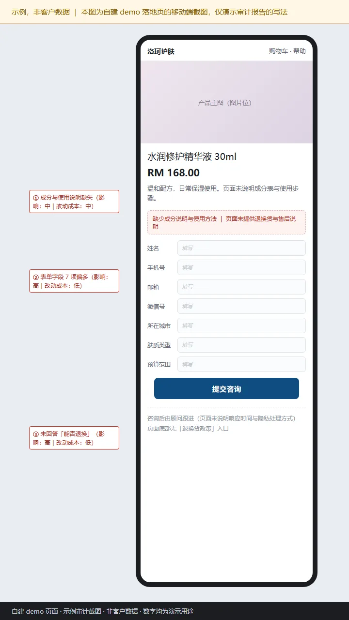
2. Evidence
- Microsoft Clarity (demo sessions, constructed data): repeated backspacing and mid-form abandonment inside the form area.
- GA4 (demo property, constructed data): form-submit events far below form-view events, concentrated on mobile.
- Device walkthrough: the form requires multiple keyboard switches on iOS, and the return policy has no entry point on the page.
3. Priority
| Issue | Impact | Effort | Priority |
|---|---|---|---|
| Seven-field form is hard to finish on mobile | High | Low | P0 · fix first |
| Return policy not visible | High | Low | P0 · fix first |
| Ingredient and usage information missing | Medium | Medium | P1 · second batch |
4. Recommended changes
- Cut the form from seven fields to four or fewer; email or phone, not both; remaining details collected in follow-up.
- Add a returns and after-sales Q&A block at the bottom covering conditions, window and who pays return shipping.
- Add an ingredient list and usage steps under the hero, written in short sentences rather than a long table.
5. Acceptance criteria
- On mobile, filling and submitting the form takes under 60 seconds, timed on a real device with a screenshot retained.
- The form-submit event appears in GA4 Realtime with parameters matching the tracking convention.
- The returns block headline is visible within one screen on mobile.
Want this done on your store?
Send the store URL; eligibility is confirmed within 24 hours. The same structure applies to your own data.